-
- Design system
- Audit and research
- Concepts and iteration
- Documentation
- Governance
- Design system
Year
2022
Role
- Product design and management
- User experience design
- User interface design
- Interaction design
- Motion design
As a Product Design Lead at Ascend Corp, TrueMoney Wallet, I am responsible for product areas like Customer Authentication and KYC, Fund in and billing, and Partner tools. In addition, I handle design operations where I manage and contribute to the Iceberg and Regional Design Systems.
TrueMoney Wallet is Thailand’s leading mobile e-wallet app. Our wallet lets customers securely make cashless and cardless payments for all everyday needs, including mobile top-ups, bill payments, online and offline purchases, and much more.
We needed “a single source of truth” for many, sometimes similar use cases across our ecosystem. As a result, designers spent a lot of time creating and recreating similar components or using different approaches to communicate the same thing across products. The design team had outgrown the UI Kit and needed a shared design system.
Initially, I took a simple Sketch Style Guide and built a series of reusable component libraries in Figma. After several iterations through critical components, it became clear that creating a Design System from the ground up would consume resources and time I did not have.
Goals
With a committee of designers volunteering to join the effort, we established simple goals for our project that would increase our design and development velocity:
- Provide a single source of truth and create consistency across our products
- Reduce complexity and provide more clarity for our end users
- Improve the efficiency of our product design process with scalable components so designers can spend more time thinking about the experience and less time tooling

Process
The design system is a product, and we treated it as such, putting it through the same user-centered design process as any of our other projects would benefit. Generally speaking, our process for the elements, components, patterns and templates in the design system follows:
- Discover: Audit, Inventory and Research
- Explore: Inspiration and Direction
- Design Components
- Document: Guidelines and Code
We maintain a regular Design System Committee meeting to review and discuss different aspects of the design system as we continue to build and grow. The meeting space allows committee members to provide feedback and discuss challenges, issues, and opportunities.
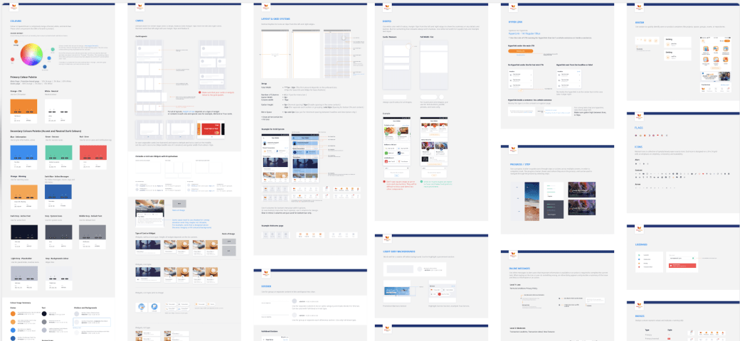
Audit, Inventory and Research
We conducted extensive audits to gain a deep understanding of our existing inventory of elements, components and patterns. We typically review each element, component, and pattern to catalog and demonstrate inconsistencies. For example, while conducting a motion design audit, I discovered fourteen different approaches to page loading.
Icon inventory with inspiration.
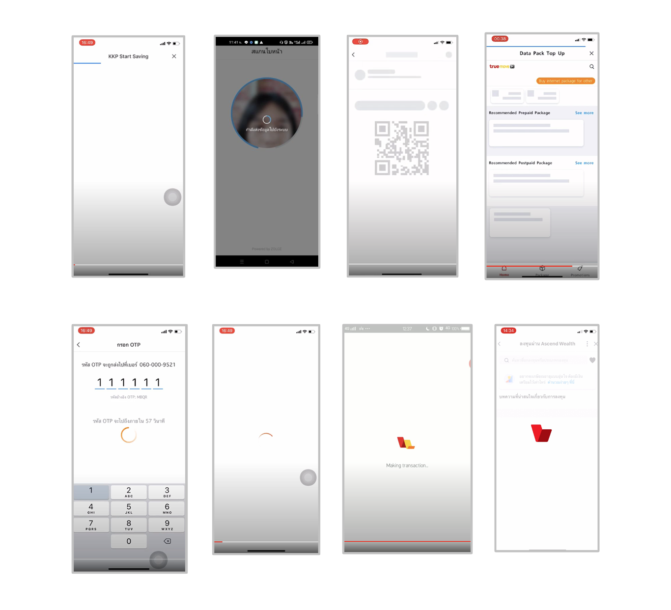
Example: Motion design inventory, loading.
Explore: Inspirations and Direction
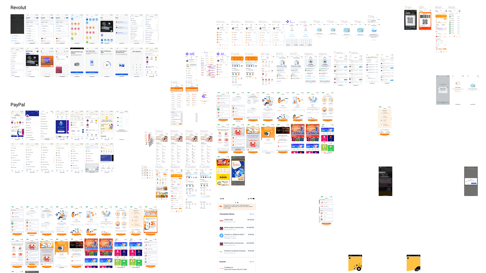
Research also included analyzing competitors’ design systems, identifying design patterns that align with our brand’s values, and understanding the unique challenges and opportunities in and outside fintech. Companies like Google, Apple, Alipay and Atlassian with complex and well-documented design systems as inspiration and direction. Google’s Material Design serves as our primary reference and we have adopted a number of principles and conventions from Apple’s Human Interface Guidelines.
Design and Define Components
Once we understand the landscape, we design UI components informed by the foundational elements, Material Design, and marketing “look and feel”. The design of components, particularly with Figma, is the best part of the process, collaborative, technical, and sparks the most joy.
In terms of organization, the design system is heavily influenced by Dan Mall, Brad Frost and his Atomic Design Methodology, as well as Modular Web Design by Nathan Curtis. We developed a design strategy that aligns with the brand’s storytelling approach, and identified key visual elements (typography, color palette, iconography, and imagery), and created the Foundation. These elements communicate our brand’s narrative and personality.


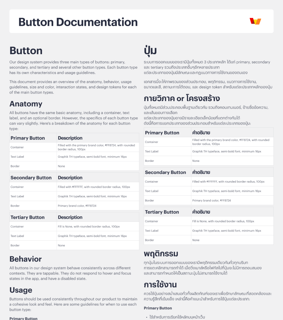
Documentation and Guidelines
Nothing says full-on (read: complete) design system like documentation and guidelines. Documentation is often the missing piece that separates a design system from a style guide or pattern library. We documented the foundational elements, components, interaction patterns and templates and have included guidelines around anatomy, usage, behaviors and accessibility.
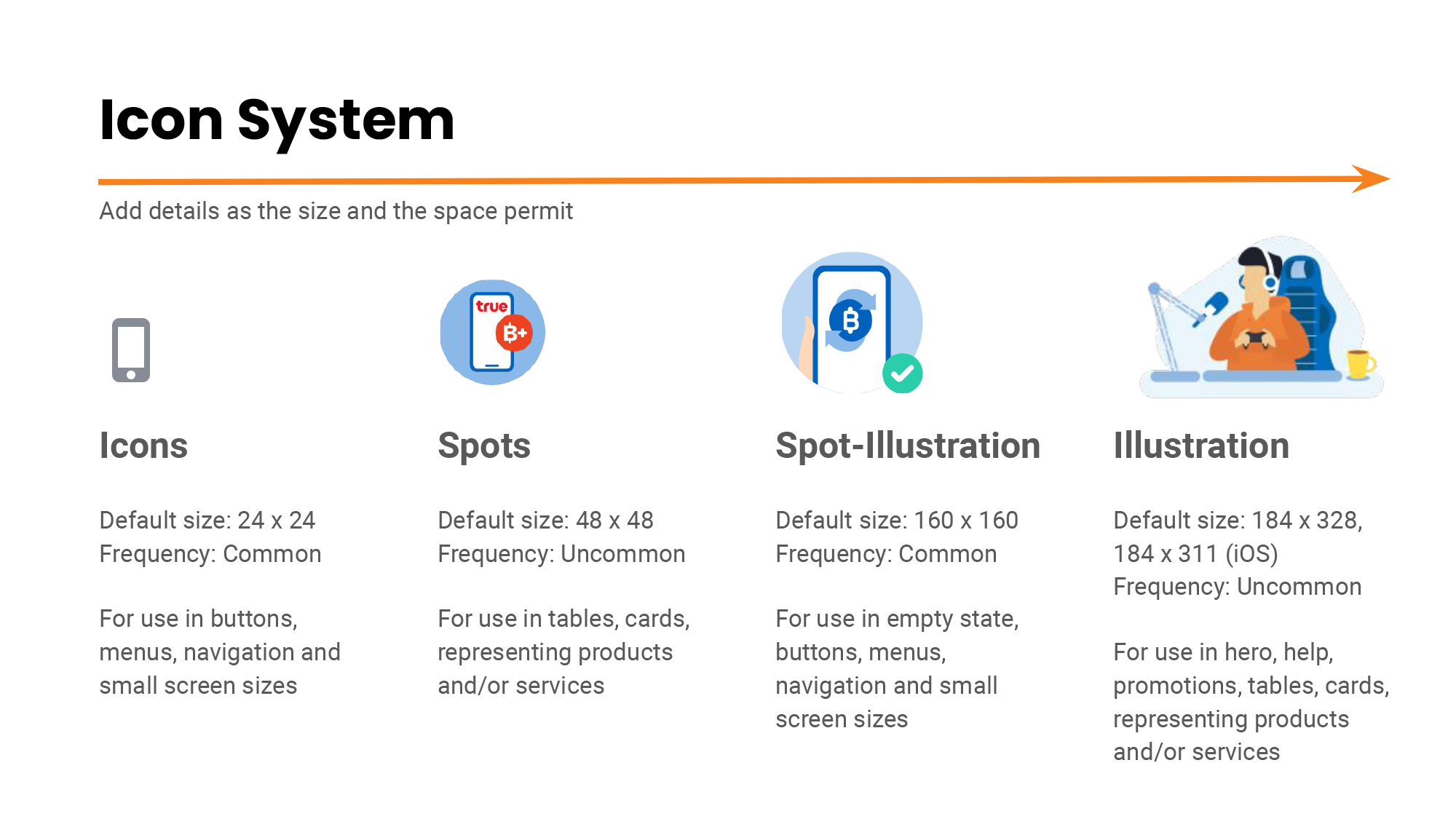
Example: Icon design system guideline presentation.
Example: Design system documentation. Thai design guidelines generated using Chat GPT.
Stakeholder Alignment
We developed a regular meeting cadence to ensure “buy-in” from stakeholders internally (the product design team) and externally (developers, product, and marketing). Sharing our design system and checking in to solicit feedback and promote collaboration is important. I mentioned the many page-loading approaches earlier. During an alignment meeting with developers, we negotiated 14 loading types to 3 options (a skeleton screen, an orange, circular rotating option, and an animated logo option) to indicate backend processing and feedback to the user and documentation on when to use each option.
Takeaways
The design system is not static, “one and done”. I’ve learned a lot and love my work on the design system. Here are a few takeaways:
- A lot of work is done in the design tool, and a fair amount is outside of Figma. Process management and regular check-ins provide an opportunity to flex my skills in google sheets and collaborate with designers, developers, and the product team
- Speaking of developers, a dedicated engineer or two would round out the team and provide a critical part in realizing the design system
- Regular usability testing to validate components in the real world with our customers
- The work is continuous and copious. (Do not attempt to go alone in a large company.) A dedicated design system team would surely go a long way to build the worthwhile effort that is a design system
Thank you for reading.