User experience design
User interface design
Art direction
User experience design
User interface design
Art direction
The stakeholders of this site approached me with the desire to completely redesign this product with conventions to make the site more usable and task-oriented across every touchpoint. In addition to providing users with a consistent experience across the entire platform.
The website was experiencing a drop-off of users before reaching a restaurant detail page. Our goal was to increase reservations per week and engagement. Here are some of the requirements that came out of our definition sessions:
On average, diners in each of the Middle East markets eat out 2–3 times per week. Target those families and groups of friends to incorporate ReserveOut into their weekly routine.
The decision was made to start with the desktop portion of the site as it would inform the design decisions throughout the rest of the platform and allow the development team to deliver an update quickly.
As a part of our discovery, I conducted several interviews with stakeholders and a small sampling of users. This part of the process was supported by the existence of a product with a history to review and to analyze.
I sketched out technical structure of the web app so we could lay the foundation for the entire site. Redesigned the funnel to optimize flow to the detail page and organized the site into collections by both food type and location for better engagement and discoverability. After a couple of rounds of review, the dev team used the wireframes to begin laying the groundwork for the new back-end.
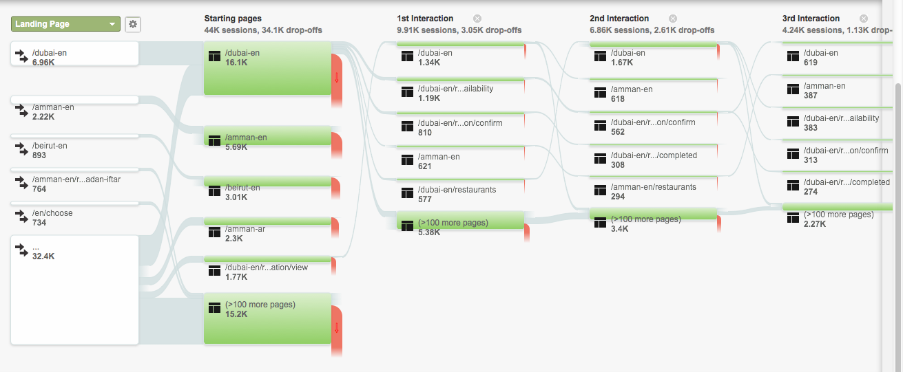
Example: A sample behavior flow of users to learn how users were engaging with the platform.
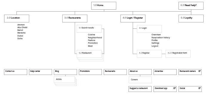
Sitemap: 4.1

Wireframe: Reservation userflow (Step 4)
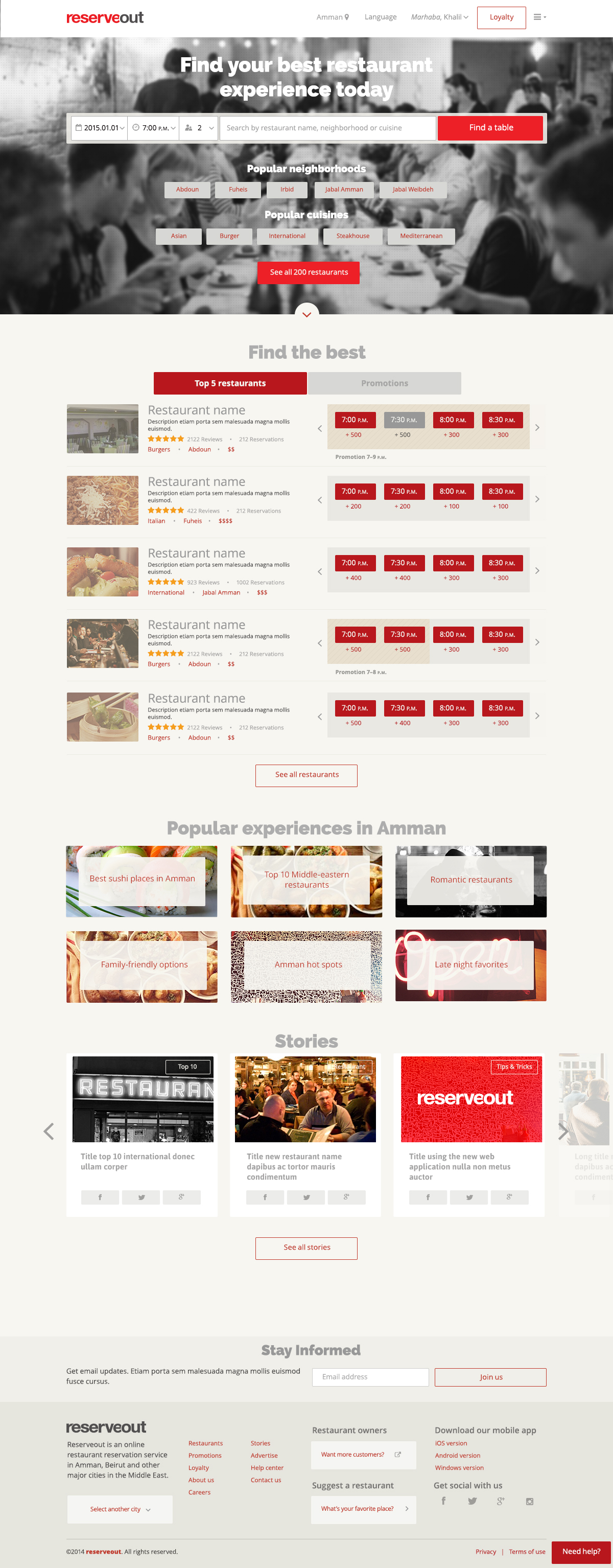
Homepage option. This page provides multiple entry points for different types of users, regular users, explorers and discoverers.
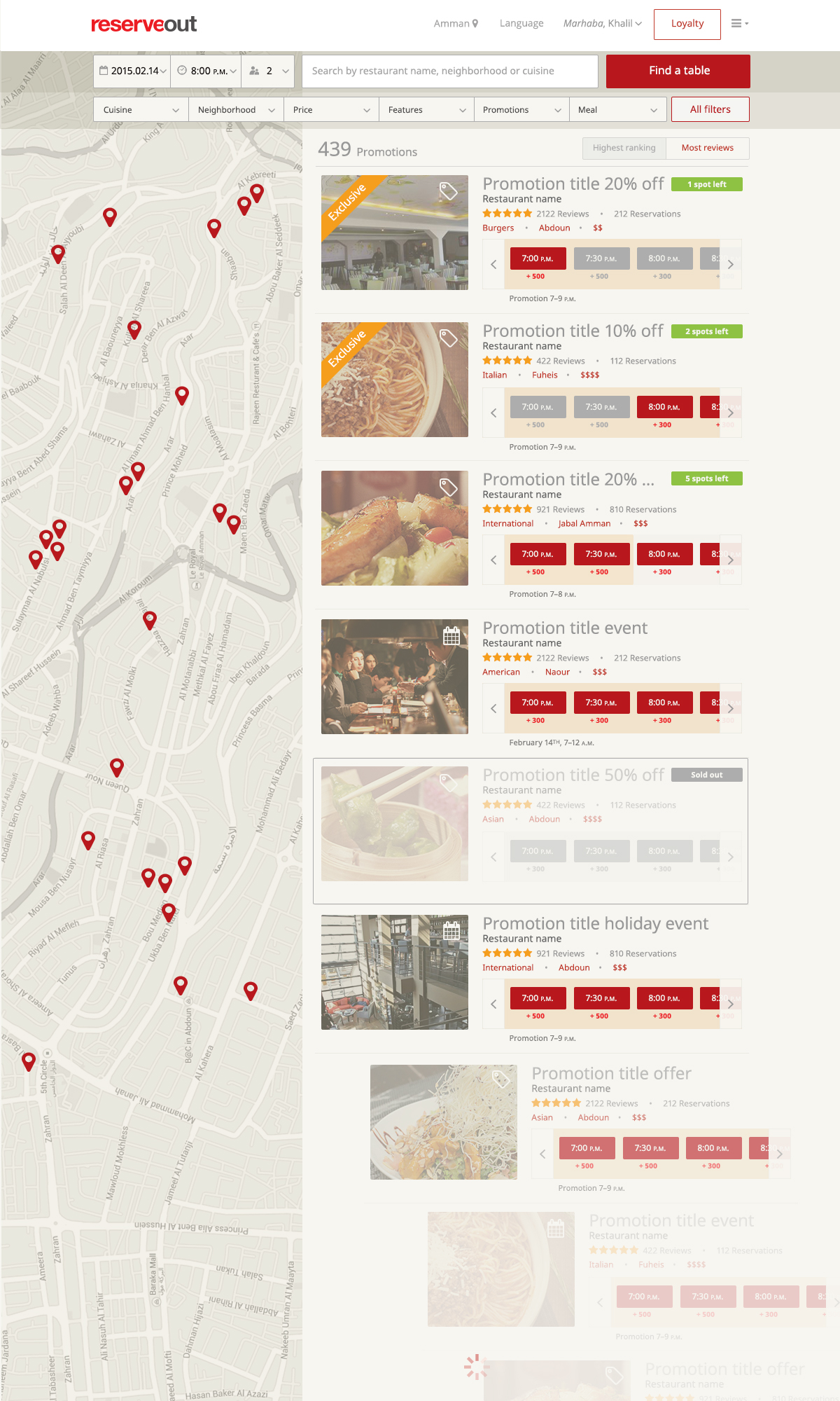
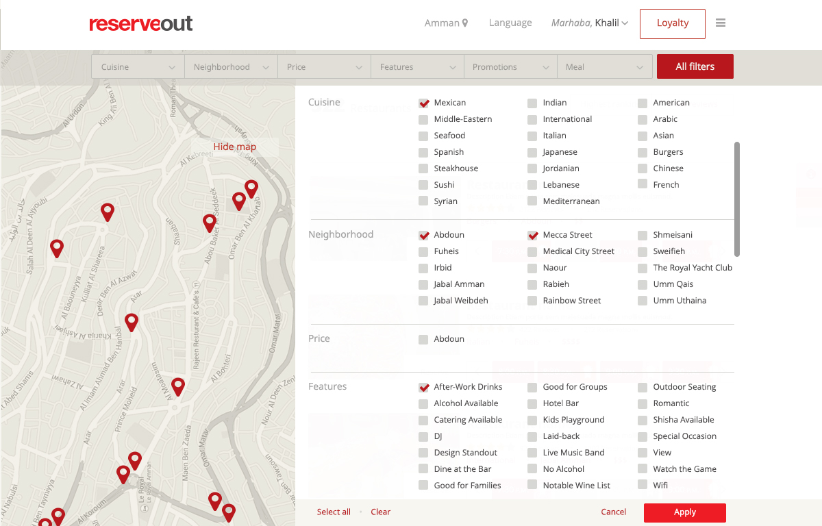
Promotions screen
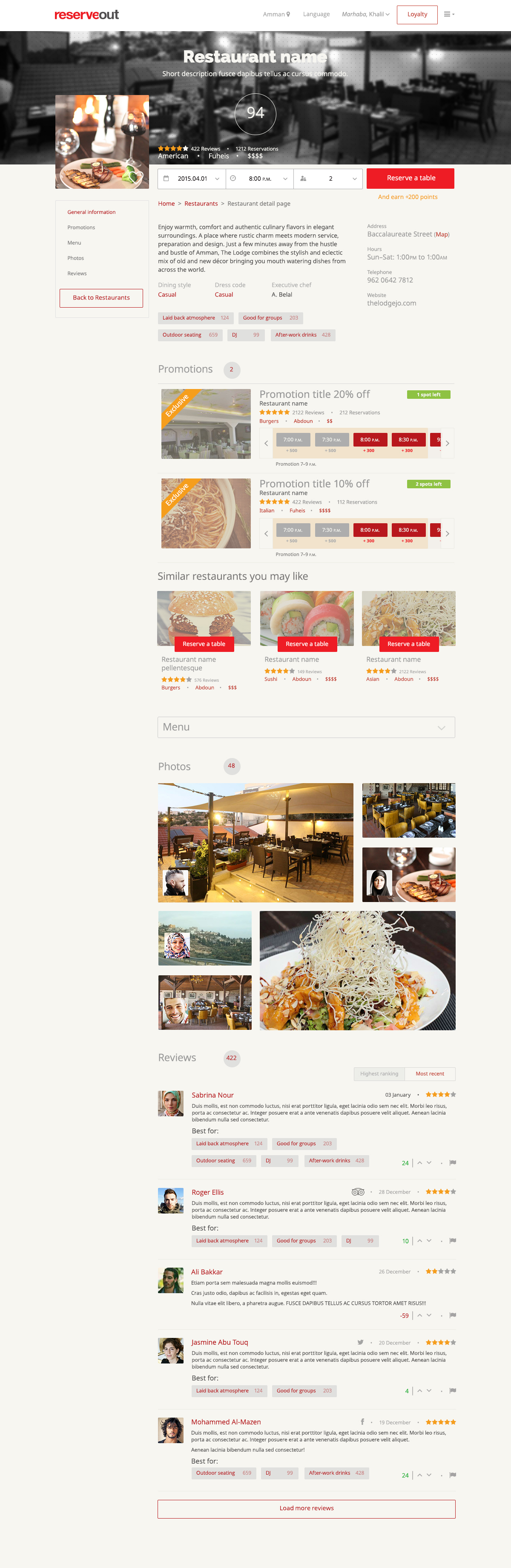
Restaurant detail page. Page contains fixed left-side navigation with smooth scroll-to links.
Restaurant detail page. Page contains fixed left-side navigation with smooth scroll-to links.
Success was evaluated by how quickly restaurant go-ers completed the new optimized booking process, how many completed conversions relative to time last year and week-over-week comparisons, and overall satisfaction with the new design.